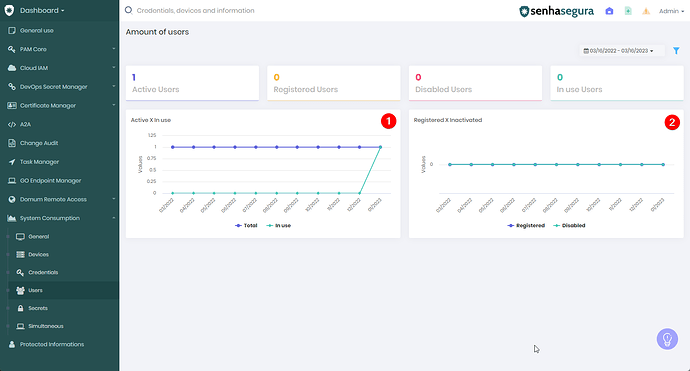
To see the graphs in senhasegura, follow the steps below:
1. Access senhasegura web and go to Dashboard → System Consumption → Users.
In the first graph, it is possible to check the value of active users with users in use, by the number of users per date. This data visualization can help identify usage trends and patterns, allowing the team responsible for the system or feature to take action to optimize usage and performance or increase efficiency.
In the second graph, it is possible to check the value of registered users with inactive users, by value per date, making it possible to view user usage more clearly and have control over it.
